WILLIAM BRIAN
Mobile App - Colorado Fire Watch
The Colorado Fire Watch app was designed by William Brian to further help the average Coloradan stay on top of and deal with wildfires. Due to global warming and less moisture in Colorado - wildfires are becoming more and more common. The reason why I designed this app was I wanted to create a safe place where people can write complaints and forums about fire hazards locally.

Project Brief 01
To start, this assignment tasked us with creating a mobile app on Adobe XD that would allow for a place where people could alert authorities about non threatening emergency scenarios. My app focused on Colorado's wildfire issues. The app is suppose to work as a mediator from civilians all the way up to firefighters. Civilians will use the app and produce forums and information about potential fire dangers near them. While app workers can send this information to professional people who can deal with the situation.
Approaching This Project 02
The approach to this project was I wanted to create a simple app that is easy to navigate and functions well. The colors and background on each page would be a dark blue and light gray. These colors would go easy on the eyes and the blue would frame the gray, giving an aesthetically pleasing visual. Within these colors there were hidden meanings. The gray was representative of the ash and smoke that fires produce. The blue was showing the water needed to disrupt fire.
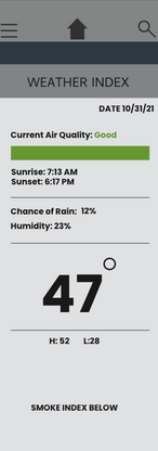
The text used included quality type faces such as Poppins, Helvetica and Gurmukhi Sangam MN. The main softwares I used were Adobe Illustrator, Adobe Photoshop and Adobe XD. These apps all work well together and it was super useful and easy to be able to transport designs from app to app. When working on this project I followed a timeline and started by researching and discovering more about wildfire websites. I eventually started producing vector designs and I used free photo stocks when needed. (Fires, Map of Colorado, Animals, Mountains)
Fire Research 03
"Fires have burned more than 400,000 acres in Colorado during one of the worst fire seasons ever in the state" (CNBC 2020).
"Our 2020 wildfire season is showing us that climate change is here and now in Colorado. Warming is setting the stage for a lot of burning across an extended fire season," says Dr. Jennifer Balch, professor of fire ecology and director of Earth Lab at the University of Colorado Boulder." (CBS NEWS 2020).
As you can see 2020 was a devastating year for Colorado when it comes to wildfires. I have keen memories of the air quality that summer being absolutely horrendous. Each year less and less snowfall which leads to milder winters is causing our summers to be hot with limited water. These up coming droughts are going to be a huge issue for Colorado in the coming decades. That is why this app is essential. A place where people can write a forum about tall grass near the a dry trail could help lessen fire risk and be a great start for saving Colorado's nature.

Design Research 04
[Flowchart]
When I first started this project I created a flowchart that would show how the apps movements would work. My final produced app follows the flowchart similarly, but the final app has more social options such as the added Image Galleries. The main way people are going to use this app as an emergency service is people can write forums and complaints directly to staff members who will either be working with Colorado Parks and Wildlife or the apps workers would pass important information on to local wildlife activists / boards. Lastly, when researching other apps and designs I found many quality youtube tutorials on how to properly use XD and its functions. (Links to videos at bottom of page)
The video walk through shows the prototype end to end screens of the app. I intend to add more features including more forum pages and a changing news feed. The walkthrough shows all screens and navigations that the app currently offers. Obviously screens like the login page need to be setup further. As mentioned above the colors of each page are cohesive and contain hidden meanings. Lastly, the app was built using Adobe XD as the foundation and Adobe Illustrator and Photoshop for the main design aspects.
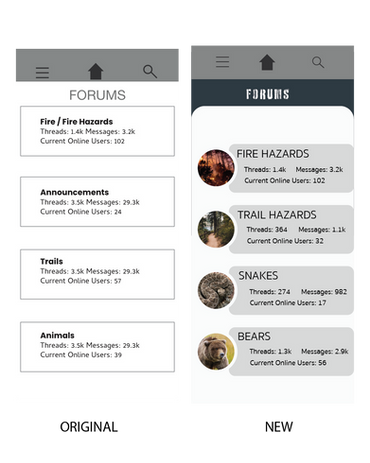
The techniques I used to run my remote usability tests is I used friends and family as the main test subjects. I had my grandma and grandpa try testing prototype 1 and 2 and I found that most people agreed that prototype 2 was cleaner, easier to use and contained much more needed information and data. I also used my younger cousins and sister to see how the average teenager and young adult would respond to the app. I found again most people levitated towards prototype 2.
The feedback I received from both classmates and family proved that I needed to do some redesigning. Some pages felt a bit lack luster so with the redesign I made sure to incorporate better design with more detail and information. I also did some redesigns on overall page layout. In some feedback I found people (especially my family) did not like the boxy look of everything. I decided to give curved edges to make it look more user and ios friendly.
Question 1: What did you find most challenging about this latest round of design updates?
Something I found super challenging with this latest round of redesigns is I was unsure if I wanted to completely trash all designs and restart or try to recover and save some designs. I decided to go with the latter and recover and redesign old screens and found that worked the best. It definitely helped getting feedback and requests from classmates and family. It was definitely difficult designing this app as it was my first time ever using Adobe XD and doing any sort of ux design. I learned some important skills though to add to my design belt.
Question 2: What was the biggest lesson you learned from this design project?
A huge lesson I learned when designing this project is how much I take for granted ux / ui design. If ux / ui design is done poorly it can lead to the design completely failing. Quality ux design is essential for any interactive design to work.


![iPhone 12 Pro Max – Forums [Typing].png](https://static.wixstatic.com/media/682dc9_c0fd3307dff74dd6bc638ffb7f2f2b1f~mv2.png/v1/fill/w_146,h_416,q_90,enc_avif,quality_auto/682dc9_c0fd3307dff74dd6bc638ffb7f2f2b1f~mv2.png)


